

Redesigning the SFL Power BI Dashboard
Date
2021
Client
Symax
Category
E-Commerce
Objectives
Overhaul the existing Power BI dashboard design to improve data presentation, usability, and alignment with organizational goals.empowers individuals to unlock their 'inner trader' through cutting-edge training techniques, time-tested trading strategies, and encouraging the development of personal trading styles. Their comprehensive training covers all asset classes, including financial, commodity, and crypto, with a team of traders, quants, developers, and system engineers working collaboratively to ensure high-quality execution, weighted risk/reward performance, automation, and scalability of strategies. Additionally, Symax Fintech Solutions actively trades traditional and digital asset classes using its own capital.
The Challenge
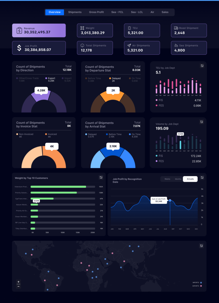
SFL Power BI's existing dashboard lacked clarity in data presentation, an intuitive user interface, and lacked interactive elements that allowed users to explore data comprehensively. They sought a design that not only addressed these concerns but also resonated with their brand.
The Solution
- Upon initiating the project, Eventistry collaborated closely with SFL Power BI to accurately define the project scope. They pinpointed specific objectives and identified the key stakeholders involved. This early-stage collaboration paved the way for a comprehensive plan that mapped out detailed timelines and set clear milestones, ensuring a seamless workflow and timely delivery.
- To understand the starting point, an in-depth assessment of the existing dashboard was essential. The team evaluated its strengths and weaknesses, gaining insights into areas requiring the most attention. Furthermore, they meticulously analyzed the key metrics and data sources that the original dashboard employed, ensuring that nothing vital was overlooked in the redesign.
- The planning phase for the redesign was both meticulous and creative. With their expertise in design research and component conceptualization, Eventistry embarked on developing a holistic design concept for the new dashboard. This vision prioritized clarity, leading to the selection of apt visualizations and layouts that would enhance data representation. Recognizing the importance of user experience, significant emphasis was placed on creating intuitive navigation. The team ensured the inclusion of interactive features, facilitating users' deeper exploration into the data.
- The culmination of these efforts was the dashboard redesign itself. Drawing inspiration from their Figma design, Eventistry crafted the new Power BI dashboard. This incarnation wasn't just a reflection of user requirements and the previously conceptualized design; it was a beacon of functionality. The team integrated advanced visualizations, filters, and interactivity features, dramatically enhancing usability. But their commitment to excellence didn't end there. Rigorous testing followed, ensuring that any potential issues in the revamped dashboard were swiftly identified and rectified.
Results
The new dashboard design provided users with a clear and concise view of data. Improved user experience through intuitive navigation and interactive elements. Successful alignment of the dashboard with the organization's strategic goals and KPIs. Positive feedback from stakeholders on the revamped look and feel, and functionality.
